
CROSS DEVICE PRODUCT
TO ASSIST USERS WITH VOTER REGISTRATION
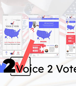_edited.jpg)
The third project in the UX Design Certificate program partnered with Coursera and Google, we were tasked to create a cross platform product based on a randomized project generator with the focus on social issues.
I was assigned a topic very close to me: assisting users with voter registration. For this project, I chose to use Figma and focused on my home state: Michigan.
For this project, more than just user research was needed, but research into voter registration processes (and much more will be needed to actually create a real-world product). But I enjoyed finding a way to make the voter registration process accessible and easier to use.
PROBLEM
Users want a cross-platform product that will make registering to vote quick and simply with clear instructions and easy to find information for voting.
UX DESIGNER APRIL '22-MAY '22 SLIDEDECK
GOALS
Our product will walk users through the voter registration form step by step based upon their state and provide a completed voter registration application they can submit per their state regulations with guidance and how and where to do so by breaking down the process into easy to follow screens. We will measure the effectiveness by how many applications are downloaded.
CHALLENGES
Not only were we tasked to create a mobile app but a responsive website. Both function for different users while also needed to be cohesive and compliment each other. The challenge was keeping the app simple, easy to use, and not overwhelming like many gov't platforms can be and then fleshing out the website so that there was more information accesible for the user.
THE RESEARCH
Because of the nature of voter registration, I interviewed 4 individuals from a variety of age groups ranging from 20s-60s. Through this study, I found that most users complained about how difficult it was to navigate state and governmental websites to simply find the form for voter registration. They simply wanted to be able to fill out the form, print and know where they needed to deliver the application. It was the difficult search process that seemed to hinder their desire to register to vote.
I also conducted competitive research on various websites, including state websites to find out exactly what forms were needed, how those site handled helping individuals complete the form, and what was lacking. Many of the sites linked to the state sites and had various helpful tips for voters such as checking their status and finding polling places.
Sara, 33
the new citizen
Sara is a busy working mother who needs a straightforward way to register to vote with reminders because she has to juggle work, school, after school and home duties.
"I know the importance of voting, but it keeps getting pushed back with everything else going on.”
Floyd, 75
the senior citizen
Floyd is a senior citizen who needs to be able to register easily and get connected with programs to help him get to the polls because he is mostly homebound in a rural city.
"I just never thought about it - until my grandkids. I want to do it for them now.”
PAIN POINTS
1
FINDING THE FORM
Users expressed frustration with trying to find the right form to complete to register to vote.
2
SUBMISSION
Users were often confused about how to submit their application and what documentation was needed and where to take it/mail it.
3
WHAT NEXT?
Users were often left wondering what was next in the voter registration process.
ITERATION
& WIREFRAMING


After doing some competitive research with other websites that offer voter registration options, voter information, and advocacy, I constructed paper wireframes specifically to simplify the process with larger graphics and text. I kept this concept through the website, keeping it clean and easy to understand.
After deciding on the general layout with the paper wireframes, the digital wireframes were iterated in Figma. To continue with the easy to process concept, each page was designed with only one step/instruction in mind.
While I expanded the concept from the app into a website that would feature more informational pages, I carried over the concept of keeping things simple and easy to find/use. I did place all the application information on one page to better facilitate a desktop experience where a user would not want to click through multiple pages while they would in an mobile app situation.
When moving into the mock-ups, the traditional red-white-blue motif was decided upon but kept minimal. The focus needed to be on the form fields and making each step easy to understand. In the website, that expanded to just one page for the application fields, where in the app, each step was a separate screen.
STUDIES & FINDINGS
An unmoderated usability study was conducted with 5 participants ranging from late 20s-mid 40s who were adult learners, many who were receiving their second degree/certificate. Participants were asked to use a lo-fi prototype of the web-based size format responsive website to book a study partner and answer a series of questions after each step taken in the user flow.
Users noted that they could use some clarification on what steps to take next and so more text was added to further assist. This will also benefit screen readers as well.
Users noted that the home page seemed crowded at the bottom. They also wanted a home button to help them navigate back to the home screen on the desktop website.
Users noted that a way to complete the absentee voter application in the same way as the regular voter registration application would be helpful so a new series of pages were added to accommodate the feedback.
1
Users needed more clarification about what each page required of them in the app
2
Some sizing of the font for links were too small for users in both app and desktop.
3
The home page of the desktop seemed too crowded or “bold” for some users.
4
Users requested an absentee voter option similar to the regular voter application.
CONCLUSIONS
Users expressed a desire for an easy to use voter registration product that made the intimidating government forms seem for accessible. By creating a cross platform product, we were able to create a step-by-step approach that will fill out the necessary forms for easy download and provide next-step instructions to submit their voter applications.
TAKE-AWAYS
Creating across platforms, and creating specifically for a mobile app, is both a rewarding and complex process. What works for a website does not work for a mobile app which needs to be service (wifi, etc) friendly across many areas and cater for on-the-go concepts, where a website can further expand on the principles laid out by the mobile app.